Archive for the ‘Web Development’ Category

Using Sprites: block,sliding doors and inline within the flow


Some new techniques for working with CSS sprites

Many people limit themselves when it comes to css sprites. They are convinced of limitations with sprites which I have found don’t exist. The gates are opened with these techniques to be able to use sprites creatively in pretty much any situation. We’ll look at where sprites can speed your page load times, when and where to use them and I’ll show you a new technique which I haven’t found documented before.

Before we look at specifics, here are the benefits to using sprites

  1. Modern internet connections are pretty fast, which means that page speed bottlenecks are not often in the size of the download, instead on the number of requests made to the server. Using sprite files can drastically reduce the number of requests made.

    As a real world example, in a recent project I have reduced the number of image files by about 60 using the techniques below.

  2. You can also include all your structural images in a single sprite file and heavily cache it therefore, exponentially relieving the load on the server with more page views.

    The following table demonstrates this with a sprite image file with 30 images inside it:

    Number of unique visitors Number of page views Number of server requests with individual files and no caching Number of server requests when using the cached sprite file
    2 1 60 2
    2 4 240 2
    2 8 480 2
    4 1 120 4
    4 4 480 4
    4 8 960 4

    You should be able to see the benefits, even with 4 unique visitors. Imagine the gains made when a site has several thousand unique visitors every day.

  3. Management of small images is easier. I tend to start a sprites psd to include all the images in. This means that when there is a change to any of the items you don’t have to sift through a large number of files. You can also apply changes across a set of images for older browsers or other style sheets (eg. high visibility, black and white print)

When and Where to use sprites

When you are faced with a website design look for images which:
  • Are found in the main structure of the page
  • Are small icons or motifs
  • Very rarely (if ever) change
  • Button backgrounds
  • Navigation backgrounds (ie tabs, arrows)
When you can’t/shouldn’t use sprites
  • Regularly changing content
  • Content managed images
  • Repeating backgrounds (it is possible but with many limitations)

Time to sprite – 3 Techniques

You can follow these techniques with the techniques for working with CSS sprites demo page.
As far as I can see, there are three distinct types of potential sprite usage within pages.
All of these examples make use of the following sprite image:

Block images

A common scenario where an image is placed within a block element with a fixed width and height, and either floated or positioned absolutely within the page.

#spriteBlock {
background: url(sprites.gif) no-repeat -60px -52px;
display: block;
float: left;
height: 62px;
margin: 0 15px 15px 0;
text-align:left;
text-indent: -9999px;
width: 62px;
}

Sliding doors

The sliding doors technique uses two images to fill a component which can expand and contract. One fills the left edge and the other fills the rest of an element but slides behind. I won’t go into the details of this, but if you want more background information, then here is a good article explaining sliding doors. Instead, I want to focus on how I would do this differently to utilise sprites better.

Unless you have sprites with semi transparent areas (there are still ways which we won’t cover here) you can include both the left and the right hand image in the same file. You should still find that the technique works with these minor modifications. The following is an example of a faux button with styles for hover and focus.
This uses the following markup:
<a href="link.htm" class="button"><span>button text</span></a>

Here’s the css:
a.button {
background: url(sprites.gif) no-repeat left -125px;
cursor: pointer;
height: 32px;
float: left;
line-height: 32px;
outline: none;
margin-right: 9px;
padding: 0;
position: relative;
text-decoration: none;
}
a.button:hover,
a.button:focus { background-position: left -175px; }
a.button:active { background-position: left -125px; }
a.button span {
background: url(sprites.gif) no-repeat right -125px;
color: white;
cursor: pointer;
float: left;
left: 9px;
line-height: 32px;
margin: 0 !important;
padding: 0 10px 0 1px;
position: relative;
}

The key differences shown in this example are:

  • We specify the same sprite image for the parent and child wrappers.
  • We use the left property instead of margins or padding to position the inner span. This exposes the right hand edge of the image over the bounds of the parent image so that you don’t see it underneath.
  • We specify a right margin to make sure the width of the parent element covers the child element.

Within the flow of text

The final usage has for me been the most contentious and painstaking to find a solution to. Inserting sprites in line and within the flow of text. I have come across various solutions to this, but not stumbled across any which are completely accessible and can be used when CSS and JavaScript have both been turned off in the browser.

My solution works by placing an absolutely positioned span within a relatively positioned span. This seemed to be the obvious and simple way forward. What I didn’t bargain for was the problems I would face getting the sprite to align consistently at the appropriate height across all the browsers.
Lets look at some markup which would serve as the text representation of the image above:
<span class="sprite">&nbsp;<span>!</span></span>

The text representation of the image is wrapped within two span tags.
.sprite {
margin: 0;
padding-left: 15px;
position: relative;
vertical-align: top;
zoom: 1;
}

The outer span tag is used to allow the sprite to continue where the original was placed in the flow of the text. You can’t apply width to an inline element, and not all the browsers support the inline-block display type, so we use left padding to give the span the width it needs to cover the size of the image.
The vertical align means that the top of the parent element is positioned at the top of the line of text. This means that when we use the top:50% on the child element, it is relative to the top of the line. Depending on the context this sprite is in, you may need to use one of the other vertical-align options to achieve the most consistent rendering across all the browsers.
The zoom declaration tells internet explorer to mark the element with the hasLayout property allowing us to use the top percentage on the child span element.
An important thing to note here is that it needs the &nbsp; within the parent tag to stop the line-height collapsing.
.sprite span {
background: url(sprites.gif) no-repeat -2px -2px;
display: block;
height: 14px;
left: 0;
margin: -5px 0;
padding: 0;
position: absolute;
text-align: left;
text-indent: -9999px;
top: 50%;
width: 16px;
zoom: 1;
}

The inner span element styles should be pretty explanatory.
Specify the height of the image (not the height of the line). We then use a familiar technique usually used to align elements horizontally. This time we use it to align vertically. Set the top style to 50% and the top margin to a negative amount (usually half of the height).
Again the zoom declaration tells ie to mark the element with the hasLayout property allowing us to use the top percentage.
Finally the text-indent hides the original text placed within the child element.

Considerations and things to watch out for

  • If you are using this with an anchor tag, then you will need to override the default outline on focus. Firefox will show it going off the page to the left.

Conclusion

As you learn to implement these techniques you will continually find new ways of reducing the load time of your website pages. They can take a little tweaking but it’s worth the gains in the end.

References

I have used a great set of icons from http://www.pinvoke.com for this example

About the Author

David Taylor is the Senior Front End Web developer at Aqueduct based in London. He’s also creator of the juxtapo front end developer tools which are in-browser tools for design overlays and template previews. David’s website and blog is at http://the-taylors.org.

Del.icio.us : ,

Finally managed to release a beta for juxtapo

Phew, I’ve been working hard at getting unit tests done, bugs ironed out and docs written so that I can get a release of juxtapo out and now it’s here.

juxtapo is a personal project I’ve been working on which gives in browser overlays and previews for template building. It’s been so valuable to me in my day to day work that I thought I should share it out.

So take a look and let me know what you think.

We’re building the new Lloyds.com

It’s now public that we’re building the new Lloyd’s of London website. The news went up on Aqueduct’s blog last week.

Progressive enhancement

This site is pretty feature rich and has been a lot of fun to put together so far. It has been very important for me to keep to good web standards and to make sure the front end is accessible to the broadest audience. We’ve used the progressive enhancement approach and built a rich interface on top of an underlying no-javascript-required base.

More info

The site is looking to launch in 2010, more info at http://www.aqueduct.co.uk/blog/2009/12/were-building-new-lloydscom.html

Javascript development and deployment strategy – Part 1

Javascript development and deployment strategy – Part 1

With the popularity of JavaScript rising significantly the amount of code within one project has grown to the extent where it needs to be separated in to separate files unless you want to be scrolling through thousands of lines of code. Whether you do this per class or namespace is another debate but I have been thinking through how all these separate files might be combined appropriately and compressed at deployment.

I have decided to itemise what I would ideally want to achieve and maybe some thoughts on how i could do it.

  1. I want to be able to split code in to appropriate sections so that i can save them across multiple files.
    • this will make it easier to find code
    • this will make code more modular and help to debug
  2. I only want one script reference within the html file even at dev time
    • i don’t want to annoy the back end devs with the hassle of different versions of the html head area
    • i want to manage easily the order in which scripts are loaded and which scripts are grouped together.
    • i want the dev to mimic the live environment as closely as possible
  3. I want a system which is flexible enough to allow me to specify which scripts get combined on deployment
    • if there are sub sections to the code which change more frequently to others i don’t want the client to have to download the full whack when something small has changed
  4. I want this to be extremely painless to implement
    • pain is not that desirable to me

With these four requirements in mind I set about my strategy and have come up with this:

  1. a root file for each set which at dev time dynamically adds the linked files to the page
  2. You can have as many root files as you want and you only need to maintain one list of links within each root file.
  3. It only takes 3 very simple steps:
    1. copy and paste short section of standalone code in to a root file
    2. set the root file js name
    3. include a list of files which will be combined on deployment
In part 2 I will give a demonstration of this in action.

Tutorial with examples for making web pages more accessible.

Quick start accessibility

I have been looking at web accessibility recently due to an up and
coming project with a global client who needs their site to be AAA
where possible.

It has made me realise how small things can make a huge difference. Here are some quickstart ways to enhance the accessibility of your sites.

1. Hidden accessibility navigation for screen readers

You should include navigation for the sections within each page. This makes it much easier for people using screen readers or mobile devices to go directly to the content they want.

The CSS:

#nav-acc {
    position: absolute;
    top: 0px;
    left: 0px;
    height: 39px;
}
#nav-acc p    { position:absolute; top: auto; left: -10000px; width: 1px; height: 1px; }
#nav-acc ul   { list-style: none; margin:0; padding: 0; }
#nav-acc li    { list-style: none; list-style-image: none; }
#nav-acc a    {
    position:absolute;
    display: block;
    top: auto;
    left: -10000px;
    width: 1px;
    height: 1px;
}
#nav-acc a:active,
#nav-acc a:focus {
    z-index: 1000;
    top: 0;
    left: 0px;
    width: 350px;
    height: 20px;
    background-color: white;
    border: 1px dotted #ccc;
    padding: 5px;
}

The HTML:

<div id="nav-acc">
 <p>
     <strong>Accessibility links</strong>
 </p>
 <ul>
     <li><a accesskey="c" href="#content">Jump to main content [Access key 'C']</a></li>
     <li><a accesskey="n" href="#nav-primary">Jump to primary navigation [Access key 'N']</a></li>
 </ul>
</div>

Acessibility Items

There will also be various elements within your markup which need to be hidden on screen but help describe items for screen readers. For this you can use the following class and markup:

CSS

.acc-item { position:absolute; display: block; top: auto; left: -10000px; width: 1px; height: 1px; }

HTML

<span class="acc-item">description of something for screen readers</span>

2. Label form information

When structuring your forms I expect you will already be using labels for input controls but if you have a series of inputs relating to a single label (ie Address) you should include labels for each of the inputs (ie Address Line 1,Address Line 2) here is some markup to show how we could achieve this. Note that we use the acc-item class to hide the individual labels.

<fieldset>
 <span class="labelHeader">Address</span>
   <label>
     <span class="acc-item">Address 1</span>
     <input type="text" />
   </label>
   <label>
     <span class="acc-item">Address 2</span>
     <input type="text" />
   </label>
   <label>
     <span class="acc-item">Address 3</span>
     <input type="text" />
   </label>
</fieldset>

3. Document strucure

Make sure that the structure of your markup is in the same order as you
would want to read it. A good check for this is to turn off all styles
within the view menu of firefox.

Conclusion

I hope this has been helpful, it is a really quick start for anybody who hasn’t got a huge amount of time to go any deeper. For further reading the reference below goes in to more detail. It’s not particularly hard to implement these practices so lets make the web a more accessible place.

References

http://webaim.org/techniques/css/invisiblecontent/

HTML 5 examples and tutorials

I thought I would post a few really helpful html 5 examples and test pages.

A good page to keep track of is http://www.w3.org/html/planet/

Drag and Drop (works in firefox 3.5)

http://decafbad.com/2009/07/drag-and-drop/api-demos.html

Test Elements

This is a layout which uses the new header, nav, aside and footer elements to build a page as well as a few other new HTML 5 tags.
http://www.brucelawson.co.uk/tests/html5-elements.html

Layouts Tutorial

Another HTML 5 layout but as a tutorial.
http://net.tutsplus.com/tutorials/html-css-techniques/html-5-and-css-3-the-techniques-youll-soon-be-using/

Building an XHTML5 document

http://www.hagenburger.net/2009/03/html5-xhtml5-with-css-for-safari-firefox-opera-ie

Enjoy checking out html 5

Example using jQuery with ASP.Net (SOAP) WebServices

I don’t know about you, but I’ve had enough of slow loading aspx pages because of the huge ScriptManager JavaScript files that are needed to be downloaded. I also don’t see why I should have to register web services through it to be able to use them in my client side code.

Once answer is to use jQuery. We can access Asp.Net web services (SOAP) removing the need for the ScriptManager on your aspx page.

Asp.Net web services either use SOAP or JSON and for this post I will show you how to access your webservice using SOAP.

This is how you can do it:

First of all I like to organise all my JavaScript in to namespaces so that it stays neat so I declare the DT object.

var DT = {}

Then because we will be using Soap I have created a useful Soap function called getEnvelope which saves having to add the envelope xml each time you want to build a request.

DT.Soap = {
  getEnvelope: function(body) {
    var soapEnv =
    "<soapenv:Envelope xmlns:soapenv='http://schemas.xmlsoap.org/soap/envelope/'> \
        <soapenv:Body> \
           " + body + " \
        </soapenv:Body> \
     </soapenv:Envelope>";
    return soapEnv;
  }
}

You can use this ws object each time you define a new webservice.

DT.ws = function(wsUrl) {
    this.wsUrl = wsUrl;
}
DT.ws.prototype = {
    wsUrl: null,
    getData: function(soapEnvelope, fnComplete, fnSuccess, fnError) {
        $.ajax({
            url: this.wsUrl,
            type: "POST",
            dataType: "xml",
            data: soapEnvelope,
            contentType: "text/xml; charset=\"utf-8\"",
            complete: fnComplete,
            success: fnSuccess,
            error: fnError
        });
    }
}

Defining a new web service would then look something like the code below. We first create a new ws object instance and then define the HelloWorld method.

DT.wsCustom = new DT.ws("wsCustom.asmx");
DT.wsCustom.HelloWorld = function(fnComplete, fnSuccess, fnError) {
    var soapEnv = DT.Soap.getEnvelope("<HelloWorld xmlns='http://yournamespace.com/'></HelloWorld>");
    this.getData(soapEnv, fnComplete, fnSuccess, fnError);
}

Finally you can use your new web service with the following code.

DT.wsCustom.HelloWorld(function(xData,textStatus){
    alert("This is the xml response: " + xData.responseXML);
});

This is just a quick start to using jQuery to access Asp.Net web services. Here is part 2 to include XSL transforms and more advanced web methods.

Hope this helps.

Test/debug a local website on windows mobile 5 emulator

I had to test an ASP.net web project I am am doing which is designed to be viewed on a windows mobile or pda. After looking all over the internet I couldn’t find much information on how to do this through one of the many emulators that are available and can be linked up with Visual Studio. So here is a step by step guide to how I did it:

Step 1 : Connection Settings

Within activesync goto File > Connection Settings

  • Tick Allow connections to one of the following and choose DMA in the dropdown.
  • Choose this computer is connected to the internet

Test a local website on windows mobile 5 emulator - Active sync connection settings

Step 2 : Install SDK and Emulator Images

  • Download Pocket PC SDK from the microsoft site
  • Download Pocket PC Emulator Images

You can simillarly install the sdk and images for the smartphones etc

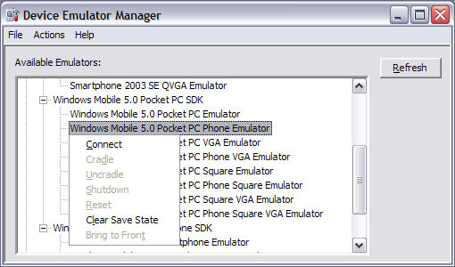
Step 3 : Device Emulator Manager

Within Visual Studio run the device emulator manager from the tools menu.

Device connection manager

Right click on the emulator and choose connect

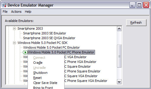
Emulator Manager Cradle

Right click on the running emulator and choose cradle.

Once you have done this the emulator will connect and try to sync with activesync. Run through the Welcome to the Pocket Pc Setup wizard with the minimal setup.

Find out what your local IP address is by doing an ipconfig at the command line then you should then be able to access a website on your local machine by going to http://localipaddress/websitevirtualdir

Hope this helps!!

Your Second Home Launched

Your Second Home - Homes/Properties abroad in Florida, Naples,St. Petersburg, Tampa,Daytona,Cyprus,Paphos,Tobago,Trinidad,West Indies

I have launched a new website this week (www.yoursecond-home.com), delved into some php for the first time in about 2 years! I was surprised at how much I could remember.

I was asked to come up with a corporate identity and implement it into a simple site giving information for people wanting to buy homes abroad in places like Florida, Naples, St. Petersburg, Tampa, Daytona and Cyprus.

jQuery Interface Animate function

Over the last week I have struggled with the frustrating override of the jQuery Animate function by the jQuery Interface Library. The frustration being that the Interface library is pretty awesome but this function requires a different set of variables and objects past to it than the original. This not only breaks any other plugins which use the original and you want to use alongside but surely this isn’t good practice for overriding functions!

I got round it by downloading the Interface source and only including the elements  I needed for the application.